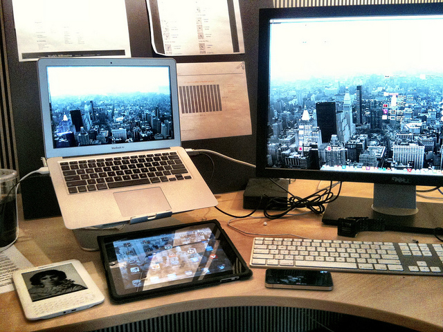
“A couple years ago, the typical steps for designing something on screen meant that a designer designed for a desktop browser. Trying to interact with the site on a mobile device was almost an afterthought. But with more focus on product design and mobile devices, sites and apps are now being designed for mobility first, desktop second.”–Design Notes blog post
“The focus of the desktop has evolved too. Depending on the functionality a desktop might focus more on settings and editing features while the tasks and activities are more focused outside on a mobile device.”–ibid
If you can configure and customize an application on your desktop, then your experience on your mobile device can be extremely focused and contextualized to that smaller screen.
I experience this on Twitter–I use the desktop app to curate my lists, adding interesting people and brands, and then when I use Twitter on my iPhone (via Tweetbot), I access these lists for consumption.
Do you have any experiences using your desktop for configuration and your mobile device for tasks and activities?

