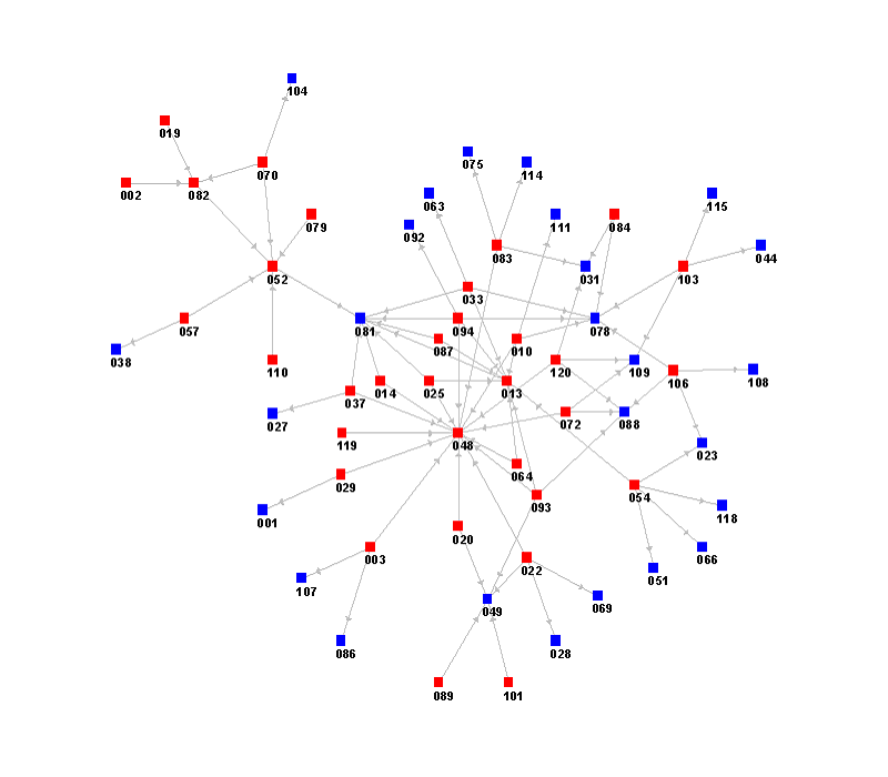
“A network map shows the nodes and links in the network. Nodes can be people, groups or organizations. Links can show relationships, flows, or transactions. A link can be directional.”

The network map above reveals how physicians seek each other out to discuss new medical treatments. Physician names have been replaced by numbers to protect their privacy. If physician A looks to physician B for advice/opinion/expertise then an arrow is drawn from node A to node B. The pattern of direct and indirect arrows surrounding a node, helps determine the influence of that person — influence is mostly local.–read full post here.
Since so many non-profits function as a cluster of relationships rather than a hierarchical tree when making decisions, a network map can provide a strategic roadmap for leading change and influencing the people most likely to have the greatest effect over others in the organization.
Besides visually displaying the nodes and links in your organization, a network map provides the following values:
- Tracking your ties and designing strategies to create new connections.
- Serving as excellent ‘talking documents’ – visual representations that support conversations about possibilities.
Do you have a clear understanding of the “nodes” and “links” in your organization?

brian,
GREAT WORD MAN, showing the dis-functionality of many non profit organizations 🙂 ha! in seriousness, many of these organizations have trouble because there is no clear line of command or role or responsibility and it becomes a mess of spagetti noodles with conflict and confusion. I could guess churches fall under this problem too. Clarify roles and responsibilities and get greater productivity and success 🙂
Thanks David. “Spaghetti noodles” is a great way to describe it! There are some advantages to it but w out a chain of command or an awareness of how decisions are made it does become a mess.